Best design system examples
Looking for some examples to help you build your design system?
Discover below our curated list of best design system examples (ordered alphabetically).
This list was built based on the definition of What is a design system. All these examples are best-in-class design systems coming with great documentation sites, design kits, Design Tokens and extensive component libraries. Most are open-source with Github repositories.
You can also discover our starter kit samples in Backlight to help you start a design system.
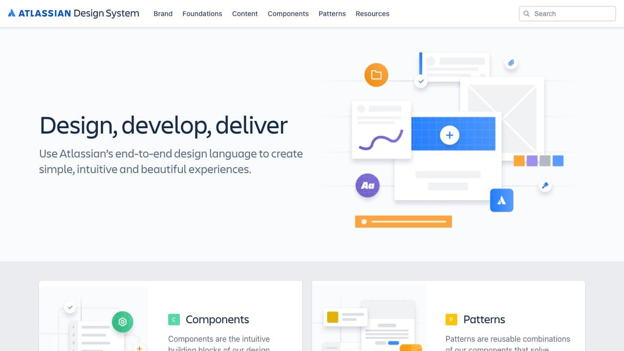
Atlassian Design System
Design system from Atlassian, also called “end to end design language”. On top of components and patterns, Atlassian offers numbers of ressources including Figma, logo, and illustration libraries.
#react #css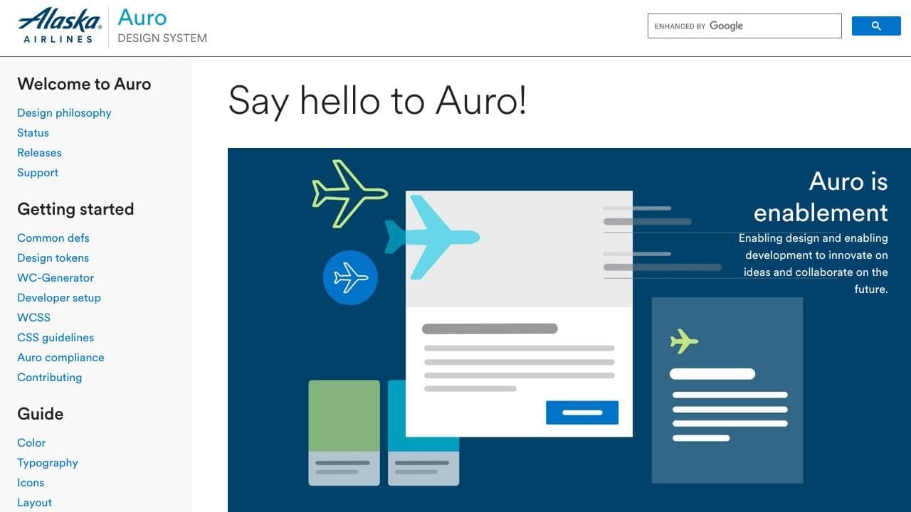
Auro
Design system of Alaska Airline, and using LitElement as a base, the Auro web components allows for highly flexible use in almost any development environment including React and Svelte.
#react #svelte #web-components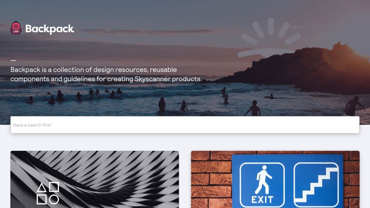
Backpack
Design system of Skyscanner, Backpack offers an extensive number of components for both mobile and desktop, on top of design tokens, icons, and guidelines.
#react #web-components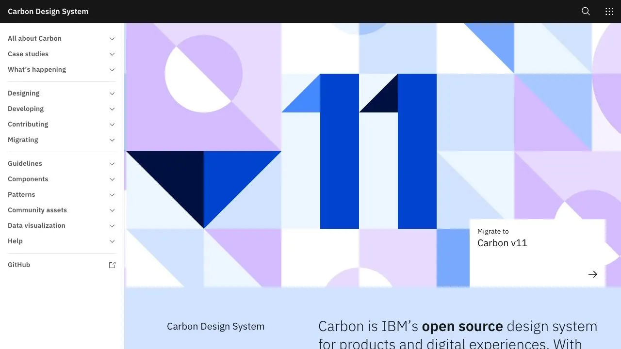
Carbon Design System
Carbon is a good design system example, open sourced by IBM. It puts an accent on accessibility while offering a wild number of components along with documentation and tools. Carbon is backed by a large community.
#react #angular #vue #svelte #css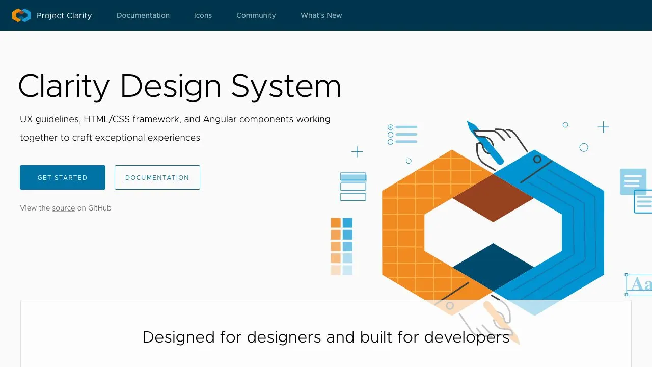
Clarity Design System
Clarity is an enterprise-focused and open source design system offering core components libraries along with extensive guidelines for both developers and designers.
#angular #web-components #typescript #css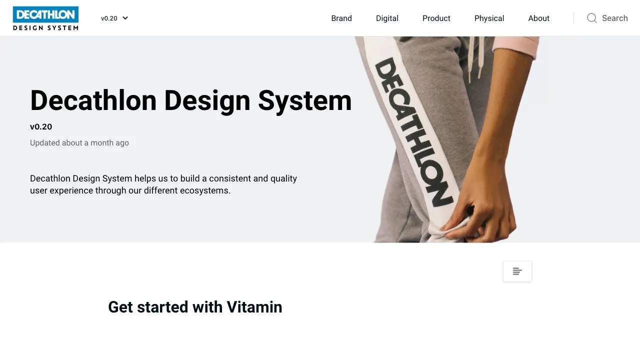
Decathlon Design System
Design system example from Decathlon. It has the specificity of going beyond digital guidelines by additionally ruling over physical products and stores.
#react #css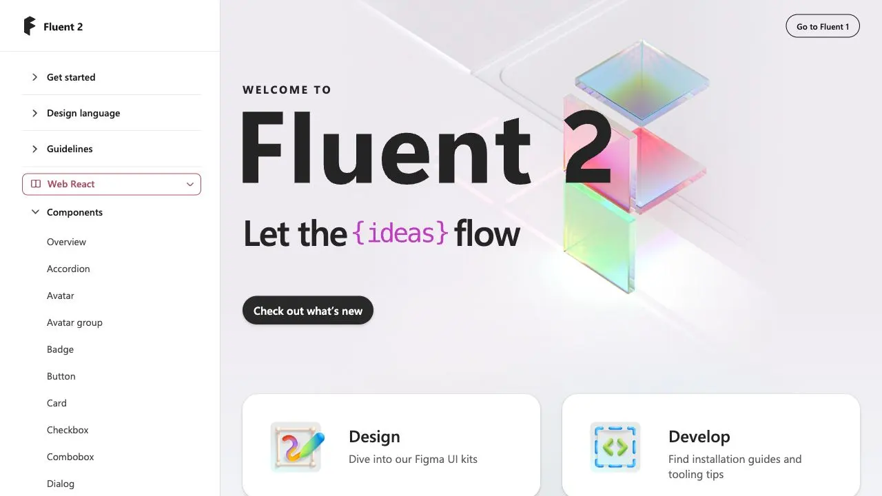
Fluent 2
Fluent 2 is a library of UX frameworks from Microsoft that allows for multi-platform development, currently supporting Windows, MacOS, Android and iOS.
#react #web-components #css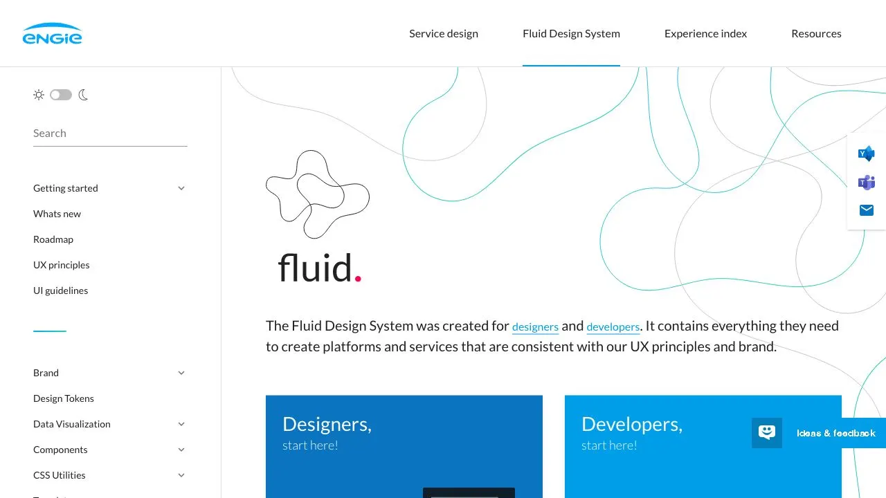
Fluid Design System
Fluid is the design system of Engie. Made for internal use at first, Fluid was build with both Developers and Designers in mind. With 8 Tokens, 34 Components and data visualisation, Fluid is a very versatile design system.
#angular #react #vue #css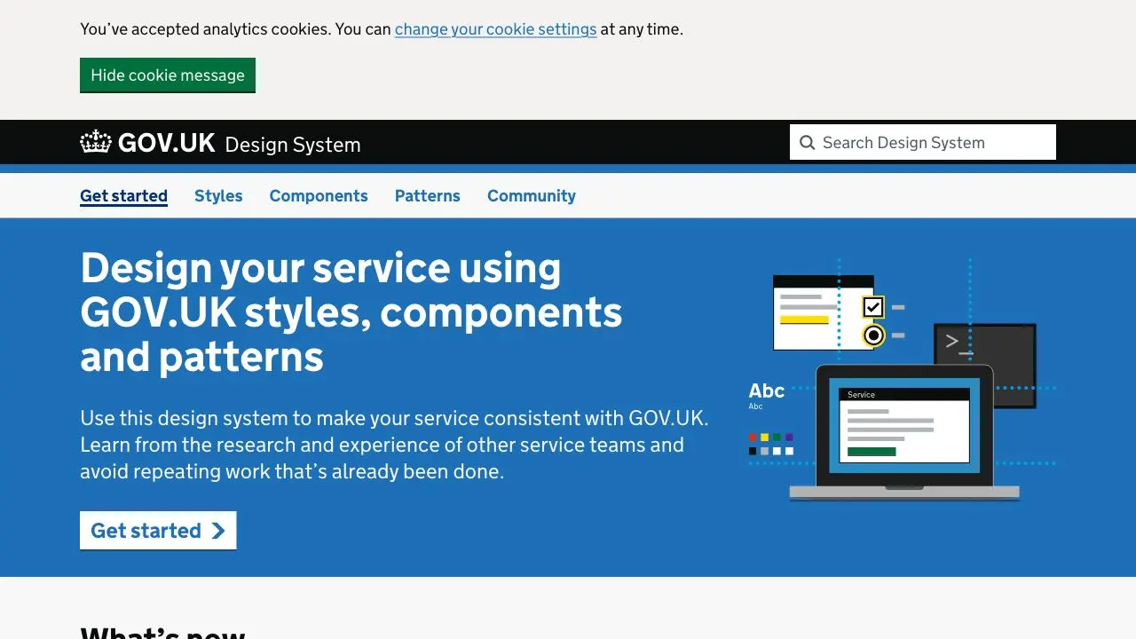
GOV.UK Design System
Gov.uk is the United Kingdom official services design system, built for reliability, consistency and accessibility. With 6 design tokens, 30 components along with patterns and extensive documentation, gov.uk is a strong design system to start from.
#react #css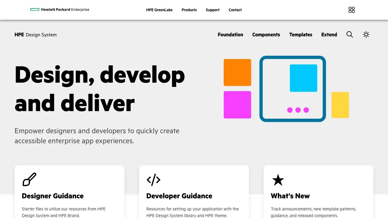
HPE Design System
HPE Design System was built to emphasis accessibility for enterprise grade app experiences. Created for developers and designers alike HPE offers tokens, components and documentation but also layouts, data table and Grids.
#react #grommet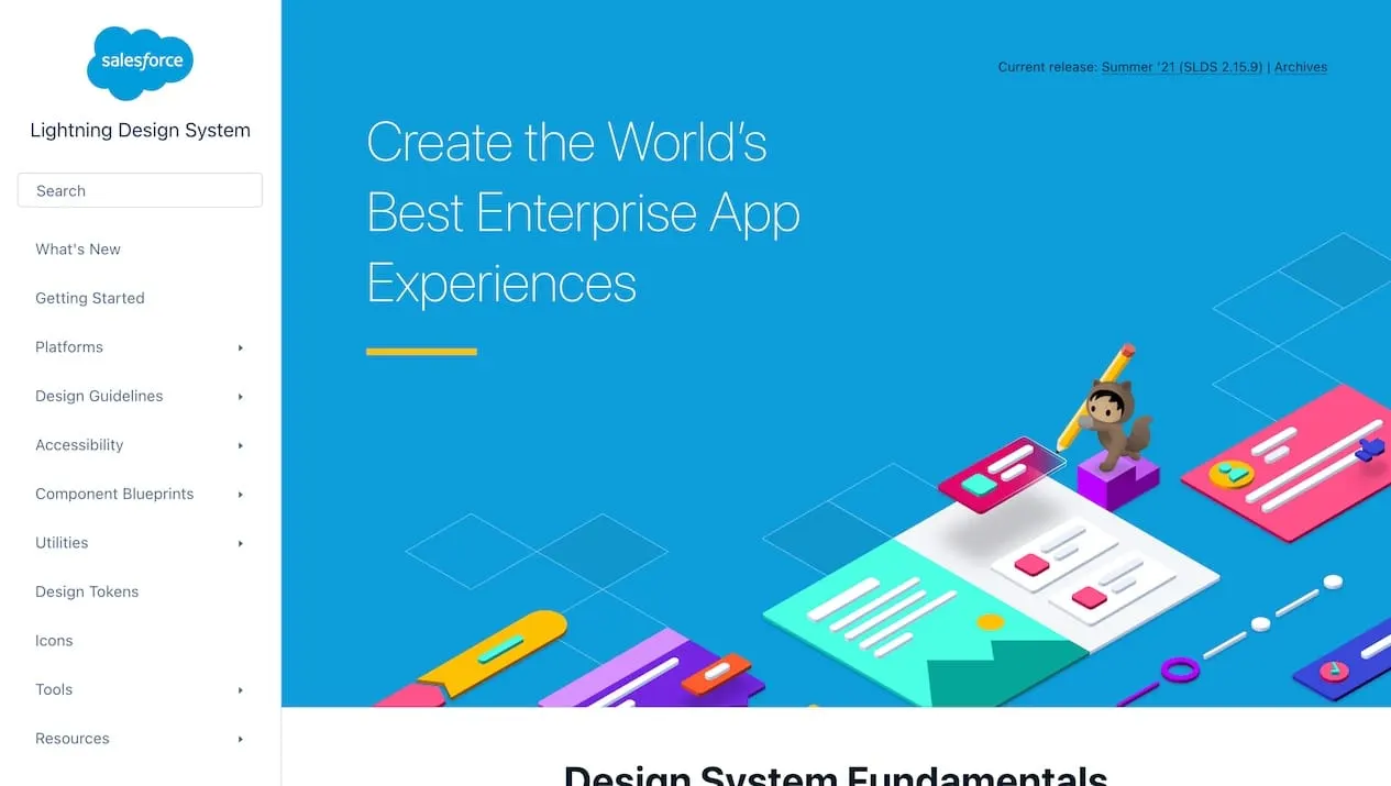
Lightning Design System
Lightning Design System is a best-in-class design system example, built by Salesforce. Lightning includes tokens and 85+ Vanilla CSS components compatible with any frameworks like React or Angular. The documentation site is well detailed and offers Sketch design kits.
#web-components #css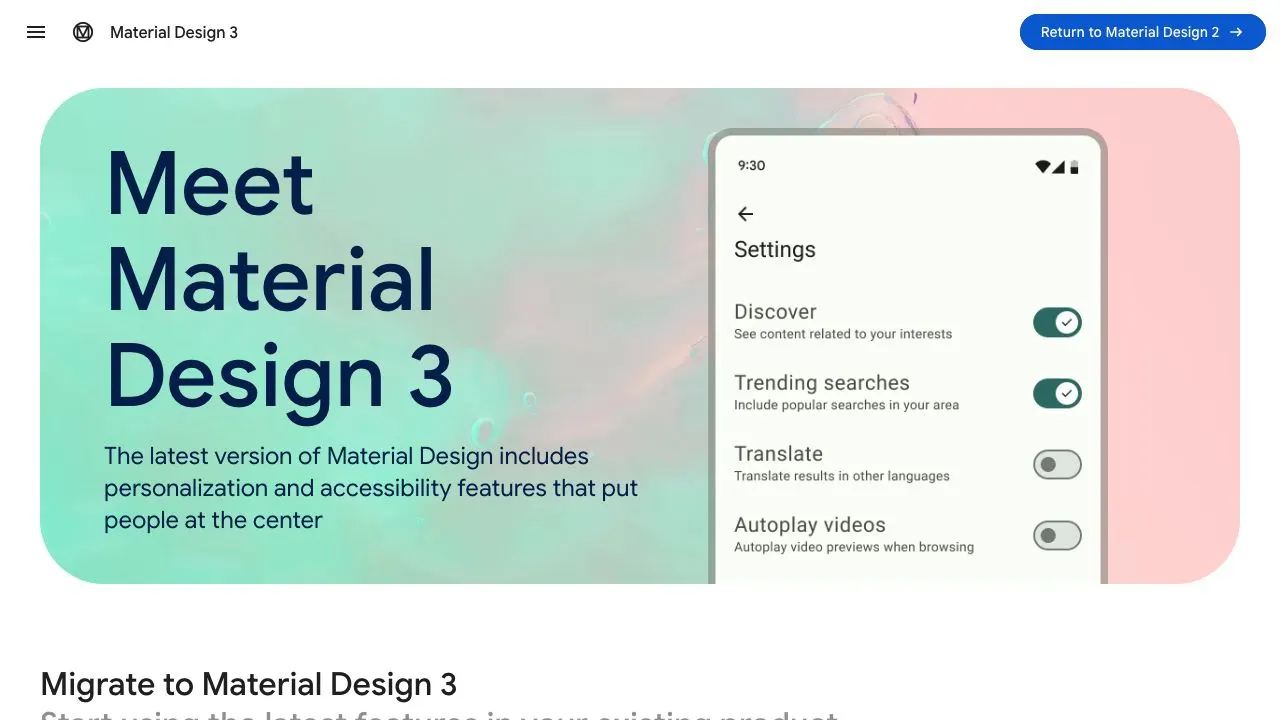
Material Design 3
Material Design is a powerful design system by Google. It was built for Android mobile development, but also support iOS and web development. This design system offers up to 30 components, with dark theme support. It comes also with documentation, Figma design kits, and some nice building tools.
#javascript #typescript #dart #saas #css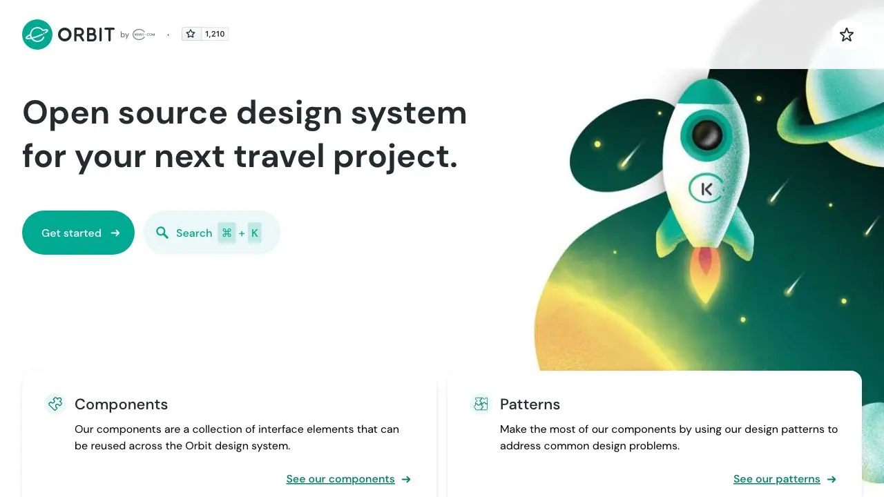
Orbit
Orbit is an example of a complete design system, with almost 100 components ready to be consumed for web (React) and mobile apps. Coming also with documentation, tokens, design kits and Figma ressources. Built and open-sourced by Kiwi.
#react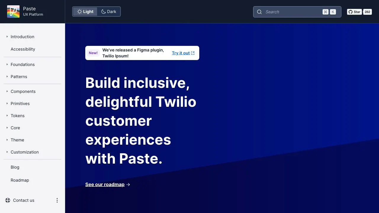
Paste
Paste is the open-source design system from Twilio. This is a good example of design system built for accessibility. It’s loaded with a well-crafted documentation, design kit assets, tokens and more than 40 React components.
#react #less #saas #css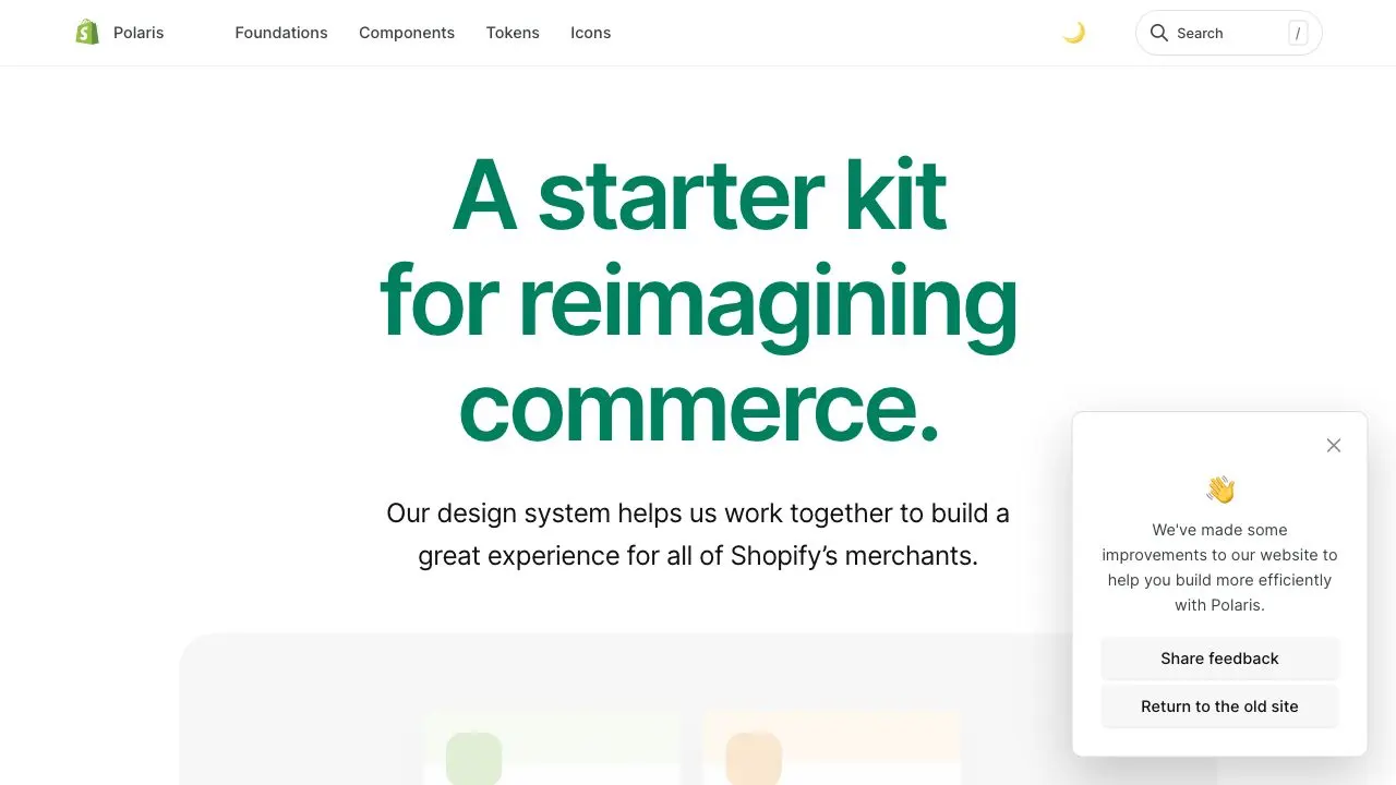
Polaris
Polaris is probably one of the best design system example. Shopify has been one of the leader in design system with Polaris. This open-source design system provides 90+ components in React / CSS, Figma UI kit ressources and a solid documentation.
#react #css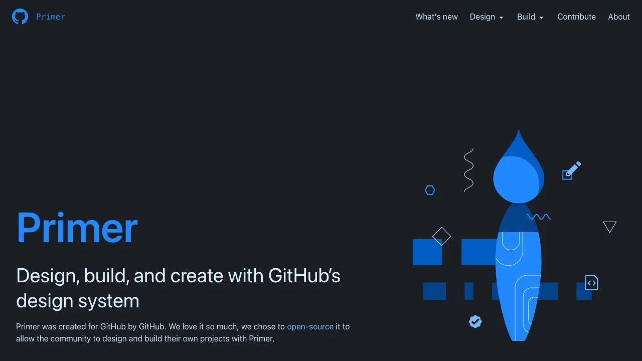
Primer
Primer is Github’s open-source design system. It comes with a light design kit and documentation. More than 40+ components are available as CSS, React / JS and ViewComponents / Ruby-on-Rails.
#react #ruby #web-components #css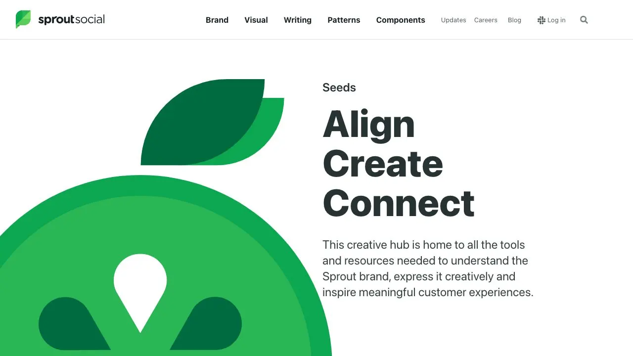
Seeds
A design system focusing on art directions and content writing, instead of the standard organisation they made the choice to divide their content into 5 categories: Brand, Visual, Writing Patterns, and Components.
#react #css #web-components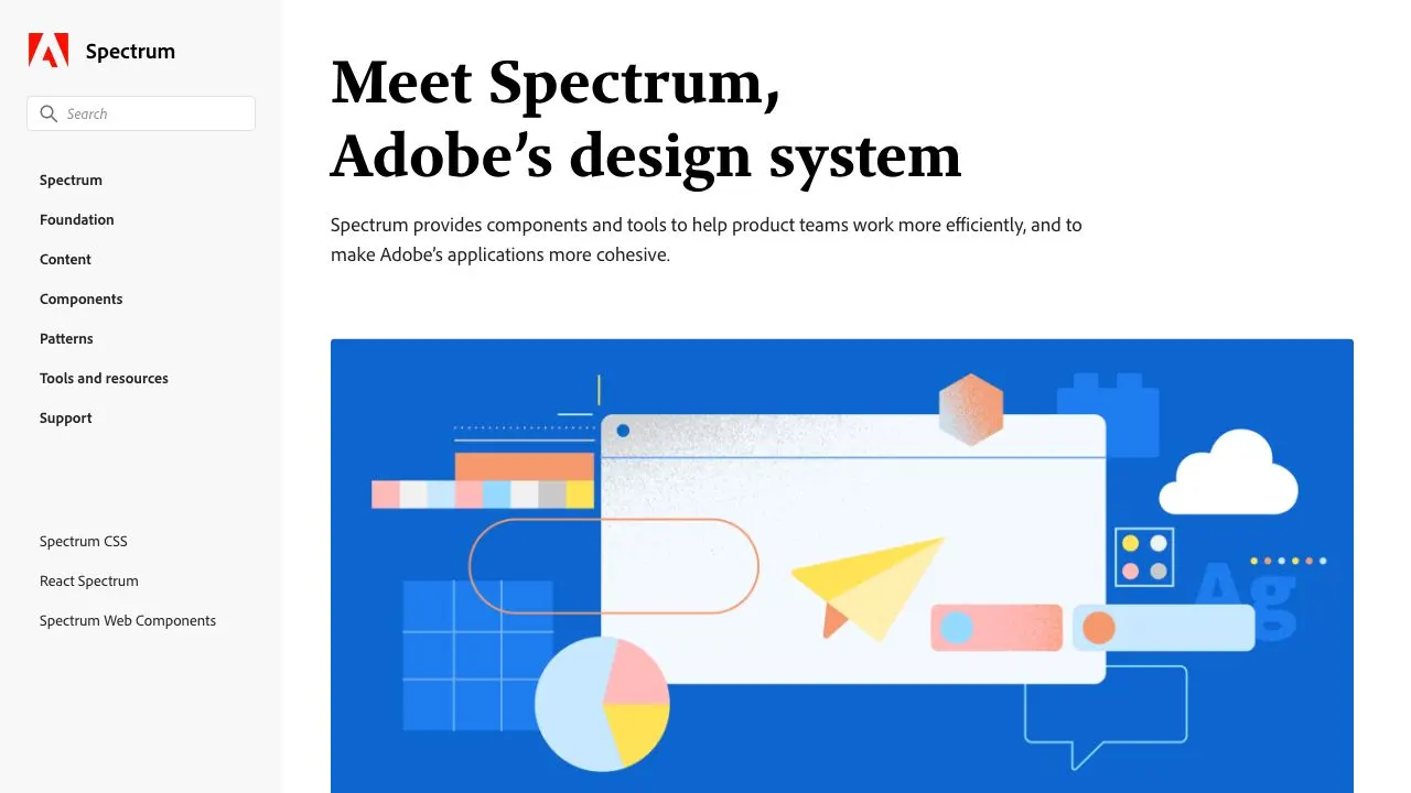
Spectrum
Adobe has built a great design system example with Spectrum. It comes with a complete documentation and a solid design kit. This design system offers more than 70 open-source components in React, Web Components and Spectrum CSS.
#react #web-components #css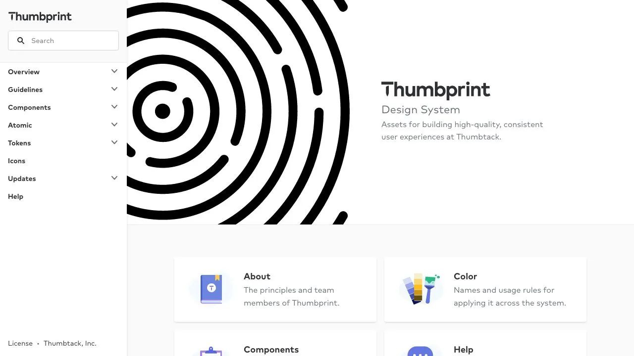
Thumbprint
Thumbstack’s design system, with implementations for React, SCSS, Android and iOS. Nice-to-have: a components overview page where users can see the state of each components per platforms.
#react #css #web-components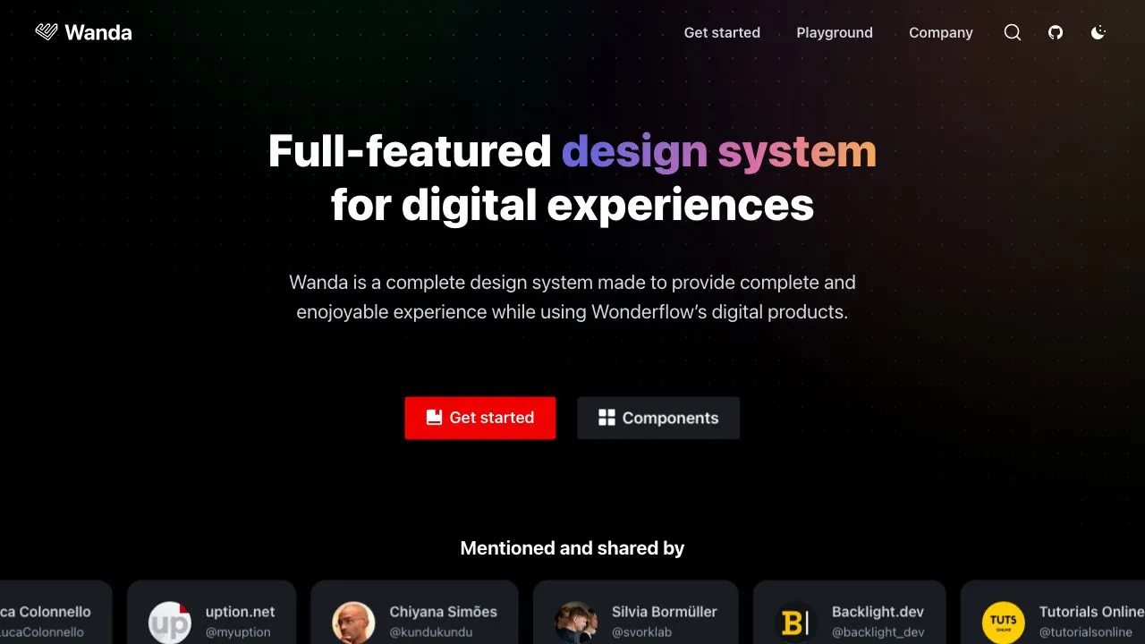
Wanda Design System
Wanda is a full-fledge open-source design system. It’s loaded with tokens, 40+ React components and a great documentation site. Wanda is a11z friendly. Made by Wonderflow.
#react #css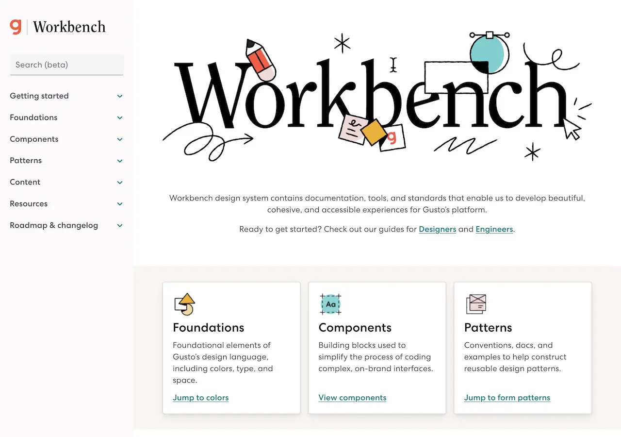
Workbench
Workbench is an extensive design system made by Gusto and offering about 50 React components. It is mainly organized around 3 categories: Foundation, Components, and Patterns
#react #web-components